12TH FEBRUARY 2013
OUGD404
DESIGN PRINCIPLES.GRIDS & FORMATS.
* * * *
FIBONACCI SEQUENCE
- A sequence mirrored thorugh out nature. Relevent in all manners of design.
- Fibonacci sequence ratio - 8:13 (Links to Golden section).
- This is not a measurement tool it is a proportion tool.
- The shape is derived from sea shells.
A series of numbers and each number is the sum of two preceding numbers.
1+1=2
1+2=3
2+3=5
3+5=8
5+8=13 . . . . . and so on.
EXAMPLE.
* * * *
GOLDEN SECTION
Forms the basis of paper sizes and its principles can be used as a means of achieving balanced designs.
1.62 is the golden number - this is what we need to divide the page.
EXAMPLE = Page of 56cm width divided 1.62 = 34.56 (rounded is 35)
56 - 35 = 21 (page is made up of 21cm + 35 cm).
PUT IN TO PRACTICE
THE RULE OF THIRDS.
- The rule of the golden ratio can be simplified throughout the rule of thirds.
- This rule governs the placement of points of interest in a scene.
- Divide any given page into thirds both horizontally and vertically ( 9 boxes ).
You can then carry on breaking down these individual boxes into thirds
(More comples designs is possible by breaking down in to a further set of thirds).
FOCAL POINTS (basic 9 box grid)
INFORMATION POINTS (further break down of thirds)
We tried this method of rule of thirds when applying it to a page from one of out chosen magazines.
We also played around with these sectioned off pieces to experiment with the focal points if the page. Rearranging text and image alters the view and layout of the page.
We took a different page and split the page up depending on the different focal points of text, headings and images.
Construct your own page layout, make it using the fibonacci sequence.
* * * *
19TH FEBRUARY 2013
OUGD404
DESIGN PRINCIPLES.
CANONS & GRIDS.
VAN DE GRAAF.
A historical reconstruction of a method that may have been used in book design to divide a page in a pleasing proportion. Used in many medieval manuscripts and incunabula.
It works for and page width and height.
- You come out with a very well proportioned text box that will suit your page size. Having larger margins on the left, right and bottom gives space for you hand so the words and images are not covered up. this was first used in medieval time and is still used to day because it doesn't distract the reader into adjusting ones self.
- It can be used double page of single page.
-These proportioned boxes can also be split further into columns to display added text or image.
OCTAVO FORMAT.
Octavo (abbreviated 8vo or 8°) is a technical term describing the format of a book, which refers to the size of leaves produced from folding a full sheet of paper on which multiple pages of text were printed to form the individual sections (or gatherings) of a book. An octavo is a book or pamphlet made up of one or more full sheets of paper on which 16 pages of text were printed, which were then folded three times to produce eight leaves.
SOURCE:http://en.wikipedia.org/wiki/Octavo
SOURCE:http://en.wikipedia.org/wiki/Octavo
* * * *
WIDTH OF COLUMN.
Column is more than just a design format. it is also based on legibility.
- Printed Collateral (text) is read by the eye of a distance of 30-35cm.
- According to empirical rule there should be 7 words per line for a text of any length.
To keep the text area light and open (in a appearance) we must consider leading.
- Over long text lines tire the eye, as do over-short ones. (this is because this take up to much energy from the reader).
- You have to judge the size of your type considering the width of you columns to ensure body text can be easily read and understood.
'ARE COLUMNS JUST ABOUT AESTHETICS OR IS IT JUST AN OPTION'
* * * *
MARGINS.
Margins have influence on the overall feel of a page of print. Too small and the page oops too full, too large and the page seems to exaggerated. A well balanced page can create an agreeable layout.
BADLY PROPORTIONED
Same sized margins can never generate an interesting page design. They create an impression of indecision and dullness.
WELL PROPORTIONED
Intended to be the right hand page due to the larger lefthand margin. More applicable to literature. these are called luxurious margins and to have your work printed in the format has a increase in price when printing.
* * * *
TASK
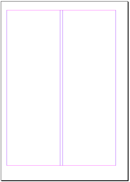
We were asked to re-create some of our drawn page layouts digitally.
Mine are shown below.
We were asked to re-create some of our drawn page layouts digitally.
Mine are shown below.
* * * *
26TH FEBRUARY 2013
OUGD404
DESIGN PRINCIPLES.
CONSTRUCTION OF GRIDS.
Before you can apply a grid you must understand the requirement of the grid for the work to be produced.
(Most of the time) Typeface, text and illustration, print method and paper quality use be determined and confirmed before hand.
Always start with small sketch, making these preparations ensure you don't have to keep coming back to alter the layout These thumbnails should be in the same proportion to your finished print.
Before starting your sketches consider how many columns you may need. (this depends on the information you wish to display such as illustration in one column text in another).
two colums can then be further split to create a four column page (subdividing).
Three columns create opportunities to layout work such as infer graphics as they are good for illustrations of different sizes. (This can also be further spilt into 6 columns).
Disadvantages of 6 columns:
- Lines of text will be narrow.
- small typeface will have to be used.
However this all depends on the function of your document.
It is suggested that it is better to display graphs, stats etc using a 4 column layout. this can give you flexibility when decided a typeface as well as the size of you images.
THE WIDTH OF THE COLUMN DICTATES THE SIZE OF THE TYPEFACE YOU CAN USE.
PROCESS OF CHOOSING A LAYOUT.
1) make a variety of small thumbnails of layouts and designs.
2) narrow down your choices and enlarge these.
3) further enlarge specific choices and select the most appropriate.
4) compare, select and repeat until you are confident with the layout you are left with.
* * * *
APPLY TYPE TO COLUMNS.
The first like (top line) must fit the flush to the top limit of the column grid.
The last line must stand on the botterm limit. These two limits are shown in the diagram below.
EXAMPLE.
-10 point type
-15 point leading
-Column length 15cm
-Loosely means use 15 point leading.
-At this lengthier there must be 10 lines per field.
meaning 30 lines every per 15cm.
* * * *
FONT HEIGHTS.
(caption type)
4 point type
6 point type
(header and footer text)
7 point type
10 point leading
Each one of text lines up proportionally even though they are different sizes.
(body text)
10 point type
13 point leading
(subheading)
20 point type
(headline)
40 point type.
The diagram above demonstrates the used of equally proportioned type when considering body text, sub-headings and Headings.
* * * *
TYPE & PICTURE.
8 FEILD GRID.
8 field grids are used for advertising material and brochures.
If using an 8 field grid you can subdivide into a further 16 field grid.
They allow various sixes of illustrations to be displayed.
They can be used with text or without.
You need to have a good perception of composition.
* * * *
WORKING ON IN DESIGN.
You can create grids, margins and column on indesign to help you layout your work.
Another way of creating accurate guides to work by is doing it bu yourself using the drag rulers and the scripts tool.
If you click and drag this icon in the middle of your page between each ruler you can ensure that the measurements down the side of the page line up accordingly.
You can then find the middle of you page quickly by clicking the bottom guide you have dragged and entering \2 after the measurement displayed in the box. (shown above)
This gives you good reference on layout to start organising your page.
* * * *
5TH MARCH 2013
OUGD404
DESIGN PRINCIPLES.
SUBMISSION REQUIREMENTS.
DEADLINE - 17TH APRIL
- Up to date blog with all completed tasks.
- Multiple thumbnails small and whittled down larger thumb nails (hand drawn)
- ruff measurements, with traditional mark ups of margins, grids and guides.
- Finalised thumbnails, hand drawn and digitalised.
FINISHED PRODUCT
- 10 double page spreads.
- You decide the format (booklet, concertina, info pack, different fold outs, etc.
- content is made up of what you have found in the '10 things task'.
(Consider how you print, the format and the outcome. Imagery, illustration, hand rendered type and image, digital type, design, layout, etc.),
* * * *
WHAT IS DPS AND WHAT DOES IT DO?
DPS stands for Double page spread.
ADDIDAS
ARCOR: BUBBLE GUM
* * * *
19TH MARCH
MOP UP & SUBMISSION.
PAGINATION
Pagination is the process of dividing (content) into discrete pages, either electronic pages or printed pages.
GREEKING
Greeking is a style of displaying or rendering text or symbols
Greeking obscures portions of a work for the purpose of either emphasizing form over details or displaying placeholders for unavailable content.
The approximation of text characters on a screen display. Greeking is often used by word processors that support a preview function. In previewmode, the word processor attempts to show what a document will look like when printed.
The term greeking is also used to describe nonsense text inserted in a document to check a layout. This allows a layout artist to concentrate on the overall appearance of a page without worrying about the actual text that will be inserted later.
FOLIO NUMBERS
Folio numbers are numbers recorded on pages of a document. these can either be on the top or the bottom of the page. Folio numbers help navigation throughout the publication.
LIGATURES
In writing and typography, a ligature occurs where two or more graphemes are joined as a single glyph. Ligatures usually replace consecutive characters sharing common components and are part of a more general class of glyphs called "contextual forms", where the specific shape of a letter depends on context such as surrounding letters or proximity to the end of a line. Example of this shown below.
Considering rulers in terms related to page layout and indesign is to do with the width, height and length of a page as well as contents displayed on the page.
Rulers can also help determine the certain areas and dimensions of other specifics with in the page.
Boxes can also relate to many feature in layout design:
Type box, Image box, Frame box as well a boxes that can filled with colour and used as decoration.
* * * *
FEEDBACK TASK
I used the double page layout I had created for the InDesign brief.
I received overall positive feedback. I received suggestion to rearrange some of the images to create a better flow. i also got told to take into consideration 'there golden section' method to see how this could help distribute my content.
* * * *


No comments:
Post a Comment