Sunday, 30 March 2014

Studio Brief 2 / Other establishments / Foods

26 / 3 / 14
OUGD505 / PART 2
CHOCOLATE TASTING ESTABLISHMENT
OTHER PRACTITIONERS.


CHOCOLATE TASTING CORNER

LOBBY LEVEL / HYATT REGENCY

The burlap sack and of the professional looking machinery adds to there air of the origins of this product and having the product displayed in this i way is very inviting to this visiting the establishment.

*  *  *  *


THE DARK CHOCOLATIER 

This chocolate shop is actually supplied by a small scale chocolate factory that specialises in coated chocolates and even though its main aim is to feel products as a shop, there is a sit down and try aspect.


*  *  *  *


FOUR FRIENDS
COFFEE, CHOCOLATE & TEA

I li=ove this idea used at this coffee shop. the chocolate product is grated into the cup and served with hot milk. This means the recipient can create the hot chocolate themselves and add as much milk as to what suits their taste. i like how the customer can get involved in their hands on fast experience. They also specialise in preservative-free ingredients.


*  *  *  *


Inspiration for possible savoury chocolate products.


*  *  *  *


I really like the rustiness of this product and i think it would be good to adapt something similar that can be sold as part of a cafe as well as a packaged product to buy.


*  *  *  *


*  *  *  *


Saturday, 29 March 2014

Studio Brief 1 / Other Practitioners

OUGD505 / STUDION BRIEF 1
RESEARCH PUBLICATION.
OTHER PRACTITIONERS.

EGO PUBLICATION


I really like how the images in the images and the type work together in inverted colours to keep the aesthetic consistent yet different for each page and the information they held.


*  *  *  * 

THE CHOCOLATE THERAPIST


I really like the presentation of this book and how, as well as a belly and there is also a ribbon that it wraped around it giving the indication of a gft. The way in which the book actually looks like a bar of chocolate is vey clever and really suits the concept on the subject.


*  *  *  * 


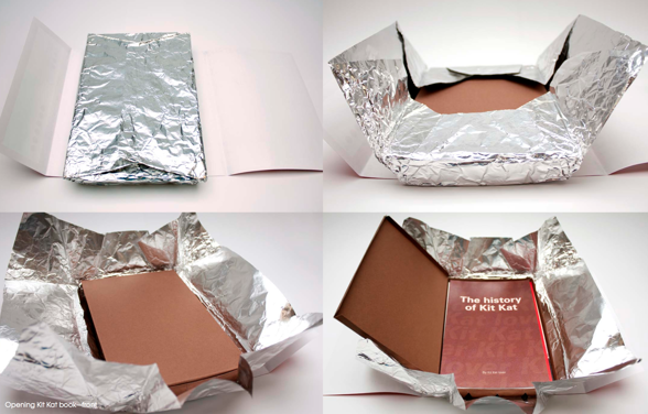
THE HISTORY OF THE KITKAT


Even though I like this project Im a litre disappointed that there are to any pictures of the publication that is suppose to be inside. Because the packing is very clever, it would have been interesting to see how the book would have been laid out.


*  *  *  *


CHOCOLATE BOX


I love the use of craft for this book. Even though it does not have any content the work that has gone into the creation of it is really evident.


*  *  *  * 


VIOLETTE CHOCOLATIER


This book is brand guidelines for a chocolate company. I like the front cover of the this book and also the pattern that has been created for the inside of the front and back pages.The colours and stocks really lend themselves to a luxurious aesthetic that will in turn reflect the ethos of the company this book is representing.


*  *  *  *

CHARLIE AND THE CHOCOLATE FACTORY


I really like the simplicity used in this cover design and how it reflects and integral part of the story. I love the illusion created with the slip caver and how it looks as though it has been ripped away to reveal the chocolate bar and a hint of the famous golden ticket.


*  *  *  * 


THE DRINKABLE BOOK


The concept of this book is truly remarkable. The way in which it has been put together for such an important purpose and how it  has been resented in such an aesthetically pleasing way. the dual purpose is so clever and gives a whole new dimension to an everyday object.


*  *  *  * 


Thursday, 27 March 2014

Studio Brief 2 / Other Practitioners / Interiors

STUDIO BRIEF 2 / OUGD505
EMPEZAR / FROM BEAN TO BAR.
OTHER PRACTITIONERS / INTERIORS.


 I like the open feel to this shop front and the large window at the front.


 I like the shelving that is shown here and i think that this would be a great way to promote the produce on sale that is pre packaged.


 I like the natural materials shown in this interior through the brick and the wood and would really portray the ethos of the company.


 I really like the brick awl and the scale of it and how it stretches through the whole interior. The neutral colours also give off that no nonsense feel and is something Id like to implicate into my interior.


 I love the unique furniture used here and how they almost represent buildiing blocks. Th chalk board wall is also a very good idea and could act as a canvas for some awl art that could show the production methods of chocolate.


 I like the way in which wooden crates are used to build up some of the furniture and decor and gives a good feel of natural and recyclable items that lend themselves to the or organic and ethical ethos.


Friday, 14 March 2014