8TH JANUARY 2013
OUGD404
SYSTEMATIC COLOURS - 1DESIGN PRINCIPLES.
INTRODUCTION TO COLOUR PRINCIPLES.
Like typography, colour is vital when dealing with readability and legibility. Colour does not have a physical form, it is a perception.
- We cannot see yellow. We see red and green as perceived colours but these overlap each other creating other colours which can the be perceived. In other words the eye is fooled into seeing these colours.
- We all perceive colours differently.
* * * *
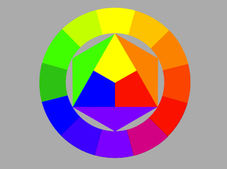
PRIMARY COLOURS = These colours cannot be made up of any other colour.
SECONDARY COLOURS = Colours that come from mixing the primary colours.
TERTIARY COLOURS = When colours continue to be mixed to make further variations.
COLOUR MODES
 |
| RGB COLOUR MODE |
The RGB colour mode is based on screen based work.
RGB - Red, Green, Blue
 |
| CMYK COLOUR MODE |
The CMYK colour mode is based on printed work.
CMYK - Cyan, Magenta, Yellow, Black (the black in this colour mode gives tone).
- Our eyes get fooled into mixing colours to get more range even though they only see limited colours.
- The more colours mixed makes your eyes subtract colour.
- The primary colours of CMYK make makes secondary colours and these colours are the RGB colour mode colours.
CMYK - A subtractive colour system. (print)
When more colours are added they start to cancel each other out (subtract) turning grey.
RGB - An additive colour system. (screen)
When more colours are added they cancel each other out making it brighter on the screen.
SIMPLE COLOUR WHEEL
 |
| PRIMARY |
 |
| SECONDARY |
 |
| GRADUAL |
COMPLIMENTARY COLOURS - Colours that cancel each other out in pigment and perception (shown opposite to each other around the wheel). Mixing these colours proportionally gives a neutral grey)
EXAMPLE OF COMPLIMENTARY COLOURS CANCELLING EACH OTHER OUT.
A perceptive example of this is when we look at a landscape we can only see tertiary/neutral colours. this is because each individual colours cancel each other out.
TERTIARY/NEUTRAL COLOURS PERCEIVED IN A LANSCAPE.
* * * *
8TH JANUARY 2013
OUGD404
SYSTEMATIC COLOURS - 2
DIMENSIONS OF COLOURS
DESIGN PRINCIPLES.
CHROMATIC VALUE = HUE, TONE & SATURATION
These allow us to judge our perception of a colour.
HUE = How you describe the colour 'not its colour its hue' ( e.g.- a bluey green or a yellowy green).
SATURATION OF A COLOUR IS KEY TO OUR PERCEPTION TO WHAT A COLOUR IS.
Surrounding colour helps up define the specific colour we are looking for.

ITTEN' 7 CONTRASTS
These allow us to judge our perception of a colour.
HUE = How you describe the colour 'not its colour its hue' ( e.g.- a bluey green or a yellowy green).
SATURATION = A total shift of colour, correspondence with hue variations. (if you saturate colour then the chromatic value drops). De-saturation creates shades and effects and laminates (the darker the colour is the less light it reflects). A over saturation is known as a tint.
SATURATION OF A COLOUR IS KEY TO OUR PERCEPTION TO WHAT A COLOUR IS.
Surrounding colour helps up define the specific colour we are looking for.
SYSTEMATIC COLOURS - 2
COLOUR WHEEL
DESIGN PRINCIPLES.

* * * *
We were then introduced to the Pantone swatch system.
PANTONE = A range of swatches used to compare colours and gives them specific numbers depending on colour, hue, tone and saturation. They also take into consideration surface types. (Because colour is perceived differently by everyone it has to be in a systematic order).
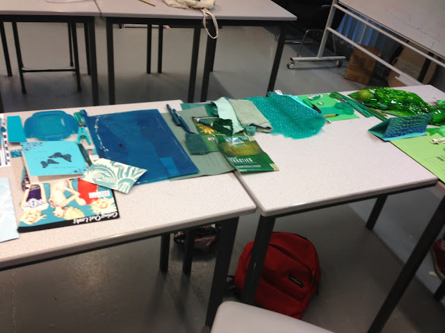
Out of the item we had collected as a group, we deliberated and determined different catagories of colours. Our categories were:
bluest,
dullest,
palest,
brightest/luminous,
darkest,
yellowest and
greenest.
We then used various pantone swatches to specifically match the colour of these items to the systematically name colour on the swatch.
BLUEST = Folder ( Coated Vol.2 - 7474c / 80% )
DULLEST = Sponge top ( Un-Coated Vol.2 - 34354 / 60% )
http://www.cal-print.com/InkColorChart.htmPALEST = Tissue ( Un-Coated Vol.2 - 3564c / 30% )
BRIGHTEST/LUMINOUS = String ( Coated Vol.2 - 802c / 80% )
DARKEST = Bobble ( Un-Coated Vol.2 - 34354 / 80% )
YELLOWEST = R.I Bag ( Coated Vol.2 - 809c / 80% )
GREENEST = Card ( Un-Coated vol.2 - 354u / 70% )
* * * *
SYSTEMATIC COLOURS.
USFUL LINKS FOR FUTURE REFERENCE.
DESIGN PRINCIPLES.
WIKIPEDIA - COLOUR THEORY
PMS - COLOUR CHART
LCA GRAPHIC DESIGN - BASIC COLOUR THEORY
LUMINOUS LANSCAPES - COLOUR THEORY
* * * *
15TH JANUARY 2013
OUGD404
SYSTEMATIC COLOURS - 3
COLOUR AND CONTRAST.
DESIGN PRINCIPLES.
The only reason we can differentiate between colours and object is because of contrast.
ITTEN' 7 CONTRASTS
TONE - Formed by the juxtaposition of light and dark values. This could be monochromatic (the rods in your eyes differentiate tone). The extremes are black and white, they have the higher contrast.
HUE - Formed by the juxtaposition of different hue's. the greater the distance between hue's on the colour wheel the greater the contrast (between red, yellow and blue on a white background, the blue stands out more because there is ore contrast. When these colours are on a black background the yellow stands out more.
SATURATION - Formed by the juxtaposition of of light and dark values and there relative saturations. a de-saturated is a light/pale colour. when put next to a colour which is more saturated colour is placed next to it this new colour is the strongest. this comparison between these colours helps you perceive the strongest.
EXTENSION - Formed by assigning proportional field size is relation to the visual weight of colour. Also known as contrast of proportion. (the heavier colour between red, blue and yellow is the blue because it is darker. Different amounts of colour affect how we see things.
TEMPERATURE - Formed by juxtaposition that can be considered through whether a colour is war or cool. (warm = red/orange - cool = blue) When block of colour similar to each other are placed next to each other in an order, but are separated the colours appear as a block. When they are placed directly next to each other they appear to have their own gradient.
COPLIMENTARY - Formed by juxtaposition between extremes. Opposites on the colour wheel are the extremes against each other. De-saturating complimentary colours does not affect this extreme contrast be make it worse. tis is because the strength of the colour is lacking and recedes into the background.
SIMULTANEOUS - Formed when boundaries between colours perpetually vibrate. Yellow and green stripes, the yellow starts to blur and develops an orange hue. this is because the absent colour is red. as the two colours blur the blue in the green forces out the complimentary orange in the yellow.
* * * *
15TH JANUARY 2013
OUGD404
SYSTEMATIC COLOURS - 4
SUBJECTIVE COLOUR.
DESIGN PRINCIPLES.
Colour on a neutral background imposes its complimentary colour of the main colour on to the neutral background. this is so you can perceive the actual colour more specifically.
There are three variations of a yellow hue displayed here each of a different saturation. However when the placed together like this you eye perceives you into thinking there are 4 colour present.
TO SATURATIONS OF NEUTRAL GREY
The grey on the green background influences your eye to believe that the type has a violety hue. this is the complimentary colour getting forced trough by the green on to the neutral background.
Adding the hue created from the green to the background of the type below gives the opposite affect making the greeny colour appear in the type. this is because this greeny colour is the complimentary colour to the violet.
* * * *
15TH JANUARY 2013
OUGD404
STUDIO CASE-STUDY
SUBJECTIVE COLOUR.
DESIGN PRINCIPLES.
To test how subjective colour works, in pairs we picked an objects from the colour wheel task that represented complimentary colours. (Violet & Yellow).
Firstly we placed a bright yellow washing up glove on a very neutral colour card. This is so the colour of the glove was as un affected by its surroundings as possible giving us a good idea of the true colour.
When the yellow glove was placed onto a yellow background. Because they are very similar shades of the same colour, there aren't really any contrasts that apply.
- TONE - These two colours are almost opposite on the colour wheel, therefore making them near to complimentary colours - A high tonal contrast.
- HUE -These two colours are almost opposite on the colour wheel, therefore making them near to complimentary colours - A high hue based contrast.
- SATURATION - The yellow object is more saturated than the magenta background, however both colours are still quite strong - a medium saturation contrast.
- EXTENSION - from the angle at which this photo has been taken, I feel these colour are quite balanced in its proportion. the magenta is dark, however there is not as much of it as the yellow - medium extension contrast.
- TEMPERATURE - The magenta feels warmer than the yellow, causing the yellow object to saturate slightly - High temperature contrast.
- COPLIMENTARY - These two colours are almost opposite on the colour wheel, therefore making them quite extreme in contrast - A high complimentary contrast.
- SIMULTANEOUS - When looking at the contrast between these two colours for sometime i feel that a slight violet hue starts to appear in the magenta background - High simultaneous contrast.
YELLOW OBJECT ON GREEN BACKGROUND.
- TONE - These two colours are very close on the colour wheel - A low tonal contrast.
- HUE -These two colours are very close on the colour wheel - A low hue based contrast.
- SATURATION - The yellow object is more saturated than the green background, however the green is also quite a saturated colours - a low saturation contrast.
- EXTENSION - from the angle at which this photo has been taken, The green is the heavier colour but the yellow is quite light - medium/high extension contrast.
- TEMPERATURE - I feel that the warmer colour is the yellow, but only just because it is closer to the warmer colours on the colour wheel. The green is quite cool - High temperature contrast.
- COPLIMENTARY - These two colours are very close on the colour wheel - A low complimentary contrast.
- SIMULTANEOUS - I feel that the green is forcing the red from the yellow, but i think that the warmth of the yellow also contributes to this. - medium simultaneous contrast.
YELLOW OBJECT ON ORANGE BACKGROUND.
- TONE - These two colours are very close on the colour wheel - A low tonal contrast.
- HUE -These two colours are very close on the colour wheel - A low hue based contrast.
- SATURATION - The blue background is more saturated than the yellow object which i feel is stronger - a high saturation contrast.
- EXTENSION - from the angle at which this photo has been taken, The yellow is the heavier colour but the blue card is quite light - high extension contrast.
- TEMPERATURE - I feel that the warmer colour is the yellow and the saturated blue is very cool - high temperature contrast.
- COPLIMENTARY - These two colours are nearly opposite on the colour wheel - A high complimentary contrast.
- SIMULTANEOUS - I feel that the yellow is forcing the yellow is forcing violet onto the blue because it is the strongest colour - high simultaneous contrast.
YELLOW OBJECT ON BLUE BACKGROUND.
- TONE - These two colours are quite opposite on the colour wheel - A medium tonal contrast.
- HUE -These two colours are quite opposite on the colour wheel - A low hue based contrast.
- SATURATION - The yellow object is more saturated than the more de-saturated blue background - a medium saturation contrast.
- EXTENSION - from the angle at which this photo has been taken, The orange is the heavier colour but the yellow is quite light - medium/high extension contrast.
- TEMPERATURE - I feel that the warmer colour is the yellow and that the blue is very cool - low temperature contrast.
- COPLIMENTARY - These two colours are very close on the colour wheel - A low complimentary contrast.
- SIMULTANEOUS - I feel that the yellow is forcing the violet onto the blue, this is enhanced by the closeness on the colour wheel - medium simultaneous contrast.
* * * *
22ND JANUARY 2013
OUGD404
SYSTEMATIC COLOUR.
SUBJECTIVE COLOUR.
DESIGN PRINCIPLES.
10 QUESTIONS.
1. Im struggling on how to differentiate between tone and hue.
2. Can other contrasts effects the simultaneous contrast between to colours?
3. Do you call it a high or low simultaneous contrast or do you just decide which colour is suppressing which colour more.
4. when both colours are saturated ore both colours are de-saturated, do you call it a balanced or medium contrast?
5. I s extension considered balanced, or low and high?
6. How to apply these contrasts when creating different works?
7. How many colours should be used with is a single design?
8. What are the best colours to use when working on screen?
9. It it appropriate to use more that one colour when applying text to a design?
10. Is there situations in which it is better to use complimentary colour?
NARROWED DOWN GROUP QUESTIONS.
1. How can colour assist hierarchy in text?
2. Maximum or Minimum about of colours to use when designing.
3. How can I apply rules such rules such as temperature towards my design.
4. What colours appeal to different audiences.
5. Whats the best colour combination for body copy apart from black and white.
OTHER GROUPS QUESTIONS WE NEED TO ANSWER.
QUESTION DESIGNATED TO ME.
SHOULD A DIFFERENT COLOUR THEORY BE USED FOR SCREEN?
When colour is on screen the Additive Color System is used.
If you look very closely at a computer or TV screen you can see that the display is made up of small red, green and blue dots. When colour is added on top of each other on screen this causes the overlapping colours to go lighter, eventually turning white.
When colour is displayed on screen it is certainly worth keeping in mind that the light enhances colour more so than when the images are printed on paper. Because of this, as well as ensuring your design is based in the RGB colour mode, you need to be aware how the screen light can effect the colours used.
TAKEN FROM: http://webdesign.tutsplus.com/articles/design-theory/an-introduction-to-color-theory-for-web-designers/
There are multiple programs and softwares that can aid with you when making decisions of the choice of colour on screen. Ultimately It depends on the audience you are designing for as well as the type of information and imagery you are wanting to display.
OUR QUESTIONS ANSWERED BY THE OTHER GROUPS.
1- Brighter for headings, duller for body copy.
2- No fixed answer to this question, all depends on balance. suggested 3 colours as a maximum. Rather than different colours you could use tints.
3-
4- Colours have affects on the audience, different colours affect people in different ways depending on styles, culture, politics etc.
5- Temperature can affect how something is perceived. Also effects the balance of an image. It can also can effect how surrounding colours are perceived.
* * * *
OUGD404
SYSTEMATIC COLOUR.
APPLIED COLOUR.
DESIGN PRINCIPLES.
MONOTONE - 1 colour
DUOTONE - 2 colour
TRIOTONE - 3 colour
LENSE TESTER - A tool used when deciphering what colours are used and how many colours are present.
When printing with multiple colours, you use 4 plates (one for each CMYK colour) These are the stamped on top of each other with the black (key) always going last. More plates mens higher cost. Using one plate with one colour is cheaper.
When the colours are layered on top of each other, in different weights they make up an image
FOUR COLOUR PROCESS SWATCH BOOK.
- Made up of colours created by CMYK. (four plates have been used in various weights)
- The dots you van see through the lens are dots per inch (which is essential when sending a document to print.
- each plate rotates creating this tiny patterns so that the colours rant just stamped on to. if this happened the key colour place on the end would just make the image black.
- Based on optical mixing.
FORMULAR COLOUR PROCESS SWATCH BOOK.
- This can limit the amount of plates used because the desired colour has already been mixed.
- The finish on these images are very smooth/block.
When considering tint the print texture differs.
THE HIGHER THE TINT - THE MORE DOTS OF COLOUR THERE IS BETWEEN DPI.
THE LOWER THE TINT - THE MORE SPACE THERE IS BETWEEN DPI
This is all on optical illusion depending on how much white or how much colour you can see. Just because one plate may fade in colour doesn't mean there is no colour in this area on the finished image. Each plate shows a different design due to how much of that colour is needed to create the finished colour.
* * * *


No comments:
Post a Comment