OTHER ARTISTS
OUGD405
RESEARCH BRIEF.
THE MAFIA
I really like the idea of having a sash young my boxes and this is a good example of how this work successfully. It gives a very neat finish and allows you to place the logo so it is prominent from the packaging. the sash on the product works very well as is stands out form the box. With each box having the same sash it gives a sense of uniform which something i would like to portray through my work.
* * * *
Th concept of this peice is very well though out. Having very related yet everyday products really builds a sense of this and personality. Having small but powerful components helps this feeling when they are added together.
* * * *
I really like the type of boxed used here to package these products. the way in which the lid folds up give the chance to add more inside utilising the space. i like the simpleness of the design and how the designer has taken the choice to keep the box in its original card board rather than painting it. i don't like the material inside the box that is to cushion the products inside. Some how it look insufficient against the products it is suppose to be holding.
* * * *
I love the printed art work on this box and the symbols used and how it has a distinct familiarity to the design on a pack of cards. i think its clever how the designer has simply used black and white while utilising the colour of the stock of the box.
* * * *
I love the opening mechanism of this box as it resembles how to reload a gun. The draw method is something I would love to use in my project.
* * * *
* * * *

I think this is a very funny take on something that everyone (mainly americans) will be very familiar with concerning fast food companies. even though Im not sure on A few of the character displayed here i still fully understand the ethos the designer is attempting to create. Taking these 'harmless' characters and changing the context i which they are perceived has been displayed very successfully here implying the other side of fast-food restaurants that are akin money on damaging peoples health.
IMAGE: http://designspiration.net/image/3783204322289/
The vintage yet simple theme used in this design is very striking. I really like how the designer has created many different aspects to the product and, while making them different, they still remain consistent and familiar to each other. the use of different stocks and texture i very appealing and intriguing.
IMAGE: http://www.matthew-hancock.co.uk/portfolio/selected/christmas.html
MATTHEW HANDCOCK
BUSINESS CARDS/CHRISTMAS EDITIONS.
The simplicity of these designs with the use of minimalist syble is very effective and vary straigt forward. I really like the vivid contrast between the back, textured stock against the bright white type and symbols.
IMAGE: http://www.kasilworkshop.com/projects/?projectID=1638
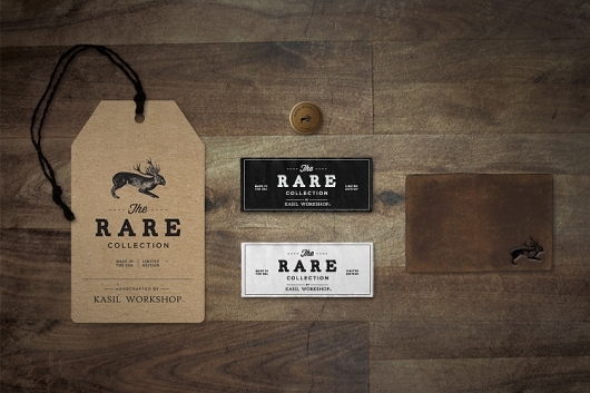
I really like the simple typography and how this in itself lays out each piece. The use of various stocks it very appealing and the use of, what looks like, leather gives a very vintage and earthy appearance. Working and printing of materials like this is something that i would ver much like to try in the future because go the the strong finish it has.
IMAGE: http://designspiration.net/image/423127541134/
I love the design given to this extremely recognisable product. Having the whole product black but creating contrast with the use of different textures is very appealing. This also gives an air of inconspicuousness and mystery as you have to look more carefully at the object and logo to truly understand what it is.
* * * *
IMAGE: http://designspiration.net/image/3783204322289/
The vintage yet simple theme used in this design is very striking. I really like how the designer has created many different aspects to the product and, while making them different, they still remain consistent and familiar to each other. the use of different stocks and texture i very appealing and intriguing.
* * * *
IMAGE: http://www.matthew-hancock.co.uk/portfolio/selected/christmas.html
MATTHEW HANDCOCK
BUSINESS CARDS/CHRISTMAS EDITIONS.
The simplicity of these designs with the use of minimalist syble is very effective and vary straigt forward. I really like the vivid contrast between the back, textured stock against the bright white type and symbols.
* * * *
I really like the simple typography and how this in itself lays out each piece. The use of various stocks it very appealing and the use of, what looks like, leather gives a very vintage and earthy appearance. Working and printing of materials like this is something that i would ver much like to try in the future because go the the strong finish it has.
* * * *
IMAGE: http://designspiration.net/image/423127541134/
I love the design given to this extremely recognisable product. Having the whole product black but creating contrast with the use of different textures is very appealing. This also gives an air of inconspicuousness and mystery as you have to look more carefully at the object and logo to truly understand what it is.


No comments:
Post a Comment