****
CONTEXT OF PRACTICE / OUGD501
PRACTICAL PEICE.
POSTER DEVELOPMENT.
For the next poster, I took another one of the quotes used in my essay and started to think of other ways in which I could visualise it while still remaining consistent with the previous.
Last year I did concentrate my essay on sexuality in the media and its effects and I did find it very interesting the undermining reasons and history that contribute to gender roles in society. i also look in to this with in my essay this year, however its is on a different angle regarding stupidity in the media.
'Human beings don't all look at things the same way, innocently as it were. In this culture, the look is largely controlled by men.' (Rosaline Coward, The Look, Reading images, p33.)
This quote regards the type of controls that are placed upon women considering appearance and perception. Even though this s not a direct form of control through governments, it is something that has been in place for many many years in order for men to remain dominant with in society. I liked the idea of making women look at themselves when choosing how they wish to appear in front others. This can take forms in fashion, clothing, makeup etc. and give a realisation to why women feel as though they have to wear these things to be seen as acceptable in today's society.
A big part of appearance for women is fashion and make up. many women in today's society will not leave the house with out make up. I feel that this would be a good subject to base some of the points mad in my essay regarding the relationship between men and women.
At first I thought that I could carry on the saying of 'freedom of choice' through out all of the posters and concept, however as soon as i saw this type on the new imagery I just felt is was to similar. Especially because the saying only has a few words with init, there are only so many ways you could rearrange the letters to make a new layout.
Because of this I felt I needed to come up with an alternative message for each poster, I want this to convey the same kind of message however be specialised fro the subject in hand.
Regarding makeup I looked into some sayings that would be suitable to convey the message of the actual, underlying reasons women feel such pressures in the way they present themselves.
- 'People will stare, Make it worth their while'.
- 'True beauty is reflected in the soul'.
- 'Beauty is only Skin deep'
- 'Beauty come from within'
- 'Not all that Glitters is gold'
- 'Fur coat, No knickers'.
I liked the saying all that glitter is to gold because I feel it os a good representation of a lot of what goes on today with popular culture regarding the glitz and glam of the rich and famous. It canals refer to the example that these people make to the public in believing that looking and living like this is a symbol of power and freedom and instead of possibly striving for goals that are beyond the present, a lot of woman strive to look like what they see in celebrities as they to want this sense of status.
'All that glitters is not gold is a well-known saying, meaning that not everything that looks precious or true turns out to be so. This can apply to people, places, or things that promise to be more than they really are.'
I applied this type in the same style as the previous poster, However I was struggling a little with the consistency because tis is a bigger amount of type and I had to fit it on preferably using the same size of font to remain the same as the other layout.
Because I was happy enough with this concept, I decided to take my own images of make up products in order to create the gridded, rigid layout to remain consistent with the regulated theme.
I was happy with this layout and the quality of the photographs however I did touch them up slightly to give them more clarity.
I started to add in the type and to overcome the issue of size and space, I overlapped the type slightly like how I had done in the first poster.
I tried the freedom of choice saying again just to make sure of my feelings and I do still feel that having different messages to be more specific to the individual points of social control will be better at depicting the issue a lot better.
I added the term, its a mans world, at the bottom of the page to again cause slight confusion and a questioning of the message the poster initially gives. This acts as an intrigue in as make up is most definitely not a male orientated product.
* * * *
‘The power to spend money is the power to live. According to the legends of publicity, those who lack the power to spend money become literally faceless. Those who have the power become loveable’ (John Berger, 1972, Ways of Seeing, p143).
Even though I would have loved to have used actual cars I don't have the facilities or the time to do this. So instead of using actual cars, I thought a good way of representing the different types of car, whether cheaper or more expensive, is throughout the logos. However because my other posters work on a photographic level, using photographic images of the emblems of each car would be more suiting.
I took images from the internet that showed recognisable emblems from car brands. I then cut out the integral parts of these photographs and began to lay them out i the regulatory fashion.
I started bay adding the text in with the saying 'money is power, power is money', however having the repetition did not look good on the images. Having the power repeated after each other just added too much confusion.
I tried a similar saying 'spending is living' inspired by the quote used in my essay regarding the power to spend money.
‘The power to spend money is the power to live. According to the legends of publicity, those who lack the power to spend money become literally faceless. Those who have the power become loveable’ (Berger, J. 1972 : 143).
I played around with the layout of this type, however I couldn't bring myself to be satisfied with it.
I also decided to add in more emblems to put emphasis on the regulated, gridded ethos.I broke up the type a little more adjusting the message to say 'to spend is to live'. I feel that this works better in an aesthetically pleasing way as well as holding an integral message.
The message behind this poster is the setting of goals in life for people to prove themselves successful which in turn leads to a false sense of empowerment through the consumerist culture.
Using cars as an example acts as a representation of status, However this status does not really have much of an impact outside of everyday life. No matter how powerful the engine is on a car we still have to follow regulations through speed limits and other laws.
A Fiat Punto can can make the same journey as a Rolls Royce.
* * * *
For the next poster, the idea arose from the quote from Berger in my essay and refers to narrowing of interests and popular features.
‘Capitalism survives by forcing the majority, whom it exploits, to define their own interests as narrowly as possible. This was once achieved by extensive deprivation. Today in developing countries by imposing a false standard of what is and what is not desirable.’ (John Berger, 1972, Ways of Seeing, p154).
When I thought about what aspects to everyday life are always playing off the same old thing, fashion kept coming up, This kind of idea was also brought up in my crit as something that is very noticeable to everyone, however goes on un-protested because we are so used to seeing it.
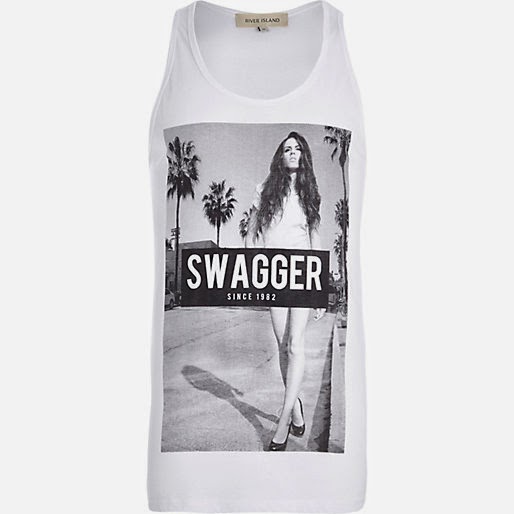
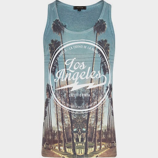
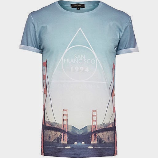
At the moment the main thing that stands out for me today in the fashion side of the consumerist culture is t-shirts. At the moment there is a massive trend in the design of t-shirts that just rely on photographic images and type. These images are usually of a place and are bright in colour.
These are examples of the type of garments I was talking about. All of these images have been taken from various high street brands and as you can see, they are all very similar in aesthetic and there are plenty more to choose from other than these.
I used these images to create the gridded background. I cut out some of the images that had people in them. I felt that getting rid of the faces helped to portray the notion of being all the same and becoming faceless as part of a trend.
I used these images to create the gridded background. I cut out some of the images that had people in them. I felt that getting rid of the faces helped to portray the notion of being all the same and becoming faceless as part of a trend.
I applied the type in consistency with previous posters. The message on this poster is something that stayed with me when researching resources for my essay was some of the information and opinion given in the online article 'In Theory - Herbert Marcuse: One
Dimensional Man?
The aspect of this comment it 'Through the rhythms of conformity'. I really like the short but thoughtful working of this and thought it would be perfect to accompany the imagery. I feel that the word rhythm is usually perceived as something fun and positive, however in this context it gives the opposite effect in depicting an obvious issue.
At the note at the bottom was derived almost by accident. I show my mum the poster to see what she thought, at the bottom I had original put the well known saying 'Same old Sh*t' with the expletive cautioned out, however my mum mistook this for 'same old shirt'. I thought this would be a great replacement by using the word shirt how every still blocking out the i to give the illusion of and expletive.


No comments:
Post a Comment