OUGD401
CONTEXT OF PRATICEMODERNIST GRAPHIC DESIGN.
'TEXTURES COLLETTIVA CONTEMPORANEA'
GIUSEPPE FIERRO
IMAGE
The structured layout of this poster indicates to me that it is a modernist piece of Graphic Design. Even though there is a slight mix of colours imagery used in this heading, I think the is just a contemporary take on it. The thought behind the heading is just to enhance the main word texture which in turn take a spin on the form follows function principle. Even though there are 2 different typefaces used, they conform with each other and do not hinder the readability of the text. The use of light and bold type helps the flow and understudying of the information presented as well as the layout of the columns.
* * * *
'KANDINSKY'S 60TH BIRTHDAY'
HERBET BAYER
This piece shows uses a limited colour scheme as well as bold and simple shapes. Each individual aspect on the page is all alined and in harmony with each other making it very legible and aesthetically pleasing. The large black, sans serif, typeface contrasts well against the light background and the blocks of red adds a slight decoration but in a clean and clinical fashion.
* * * *
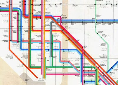
'NYC SUWAY MAP'
1972
MASSIMO VIGNELLI
This map design is a great demonstration of bring order to chaos. The use of a grid to layout the illustrated information helps to bring clarity and perspective to its audience. Vignelli has constrained the map to only four directional angles which help to avoid confusion and the use of colours help to indicate certain subway lines.
* * * *
'MEXICO 68 LOGOS'
POSTER
LANCE WYMAN
For each individual logo only a single colour has been used and the image has been made through the light coloured stock. The uniform style and icon shape helps to maintain consistency as well as making them recognisable to the world renowned event. The poster its self has a very clear layout and this is enhanced by the clinical and clean typeface used.
* * * *
CONCERT POSTER
JOSEF MULLER-BROCKMAN
This is one poster from a series that Brockman created for various concerts. He intended to use shapes and layouts to visualise the types of music the concerts played. The limited, monochrome colour scheme enhances the bold shapes and text making it eyae catching as well as clear and legible. The decorative circular shapes symbolise the music genre and also helps to organise the layout of the type and draws your eyes toward the information displayed.
* * * *


No comments:
Post a Comment